Having been Monkey Hammered on my investments in 2000 during the DotCom bust, then again on 9/11, then again in 2003 when Bush decided to invade Iraq for some still unknown reason, I decided that I had better start thinking for myself if I wanted to survive. As you see I'm a quick learner - I only had to get shellacked three times to learn my lesson. In two of those aforementioned situations, there were many largely ignored clues that things were not "right" leading up the big "event". In the case of 9/11, few recall that the market was already selling off heavily leading up to that fateful day...
Just yesterday, Barry Ritholtz announced his "chart of the year", which is low stock market volume - signalling the apathy of small investors and the takeover of the machines. So I asked myself, what is my chart of the year. And I came to the conclusion that there is no one chart that can depict the risks at this juncture, but it's when you put several together, that we come up with a more complete picture. That concept gets me back to my statement above, it's incumbent upon us to figure this out for ourselves, because as we have learned the hard way, no one is going to ring a bell when it's time to take cover...
Chart 1: Value Line Arithmetic Average
The VLA represents the total U.S. market, but it's not adjusted for market cap, so it represents the movement of all stocks equally. I have shown before that it has been hitting the same top for four times since 2011. So I Inverted the chart to show what a market running out of mojo looks like from another perspective...
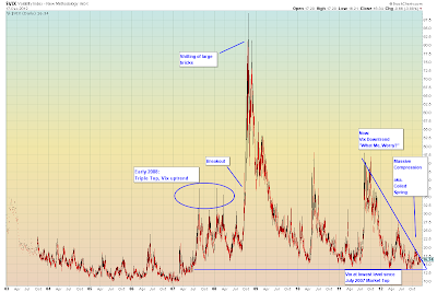
Chart 2: My other Favourite Chart, as you know, is Implied Options Volatility (The Fear Gauge).
Why would options volatility be so low going into the "all-critical" fiscal cliff event? Because HFT Bots are programmed to buy into these events (by selling options vol) and then covering (selling the market) after-the-fact. We saw it last year with the debt ceiling debacle and we saw it this year already with the election. Once again, the market is rallying into the event, which means volatility is falling, indicating a bizarre amount of complacency. The purveyors of this strategy have only two more weeks to lock in their gains for the year, assuming there is no breakout of volatility, in the meantime...
Chart 3: Keeping with Barry's theme, I won't show Apple which is the disaster of the last several months. So instead, I will show the Nasdaq which is now in a death match with its 50 and 200 day moving average. This crossover of the 50/200 DMAs which has already occurred, is called the "Death Cross" (No, I didn't name it):
Chart 4: My other favourite chart. The Transports. Vainly trying to ensure history does not repeat itself. Transports of course, inextricably linked to the real economy and the amount of goods being shipped. Just today, Fedex shipments confirm a major decline in global trade:
Other than that, everything is A-Ok...


